ACES in Blender: When It Helps, When It Hurts, and What to Use Instead
ACES in Blender: the short version
ACES is a color management system. It’s not a magic “make it cinematic” button, and it’s not a render quality upgrade.
What it actually affects is:
- how highlights roll off
- how colors compress under bright light
- how much saturation survives in high exposure
- how your render looks across different displays
If you’ve ever switched view transforms and thought:
“Why does my render suddenly look dull?”
That’s ACES doing what it’s designed to do.
Why people want ACES in the first place
ACES became popular in 3D because it’s used heavily in:
- VFX pipelines
- film workflows
- studio compositing environments
And it’s often associated with:
- nicer highlight rolloff
- fewer blown-out whites
- more consistent grading
For some Blender workflows, it’s genuinely great.
For others, it can create unnecessary pain.
The important part: Blender already has Filmic (and it’s good)
Before you chase ACES, it’s worth saying this clearly:
Blender’s Filmic view transform is already designed for:
- high dynamic range scenes
- natural highlight handling
- realistic contrast
For most Blender artists, Filmic is enough.
ACES only becomes worth it when you need:
- cross-software consistency
- compositing pipelines
- stricter color transforms
Step-by-step: How to evaluate ACES without breaking your workflow
Step 1: Set up a controlled test scene
Do not test ACES on a random scene with messy lighting.
Create a simple test scene:
- 1 product object (bottle, watch, headphone)
- 1 HDRI (neutral studio)
- 1 area light as a key
- a gray backdrop
- a metallic and a plastic material
This lets you see how ACES behaves on:
- diffuse color
- specular highlights
- metal reflections
Step 2: Render in Cycles with consistent settings
For testing, keep it consistent:
- Cycles
- 128–512 samples (depending on noise)
- Denoise ON (OIDN)
- Same resolution for every test (e.g., 1920×1080)
If you change render settings between tests, you’ll end up blaming ACES for noise or lighting changes.
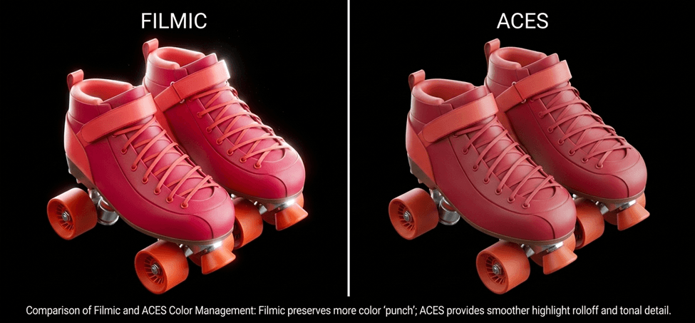
Step 3: Compare Filmic vs ACES side-by-side
In Blender:
- Render Properties → Color Management
With Filmic:
- View Transform: Filmic
- Look: None
- Exposure: 0
- Gamma: 1
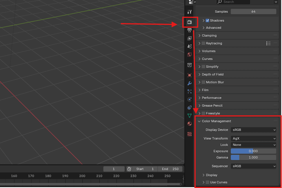
The view transform is where the biggest visible change happens. Exposure and gamma should stay consistent during testing.
With ACES (if installed):
- View Transform: ACES (or ACEScg depending on config)
- Look: None
- Exposure: 0
- Gamma: 1
Now compare:
- highlight rolloff on metals
- saturation in bright areas
- skin tones (if applicable)
- pure whites
ACES often gives smoother highlight rolloff, but Filmic can preserve more “punch” in product colors.
Step 4: Watch for the “product viz killer” problem
ACES can look fantastic for cinematic scenes, but for product visualization it can cause a common issue:
Your product color stops matching reality.
Examples:
- brand reds look muted
- neon colors lose punch
- pastels shift slightly
If you’re doing commercial work where a client expects:
“Make it look exactly like the product”
ACES can be a problem.
Step 5: Decide based on where the final render is going
ACES makes more sense when:
- you’re rendering for compositing
- you’re delivering EXR sequences
- you’re color grading in DaVinci Resolve / Nuke
- you want consistent color across software
Filmic makes more sense when:
- you’re doing quick product renders
- you’re posting on Instagram/ArtStation
- you want predictable Blender-native results
- you don’t want extra pipeline complexity
When ACES helps (practical use cases)
1) Metallic highlights and bright studio lighting
ACES tends to handle:
- strong reflections
- bright softboxes
- glossy highlights
in a smoother, more “photographic” way.
This can be especially noticeable on:
- chrome
- brushed aluminum
- glossy plastics
2) Scenes with extreme dynamic range
ACES is designed for high dynamic range.
If your scene includes:
- bright windows
- strong sunlight
- emissive signage
ACES can help keep the image from looking harsh.
3) Multi-software pipelines
If your workflow includes:
- Blender
- Houdini
- Maya
- Nuke
- Resolve
ACES can reduce “why does it look different everywhere?” problems.
When ACES hurts (practical use cases)
1) Brand-accurate product colors
For product visualization, the #1 complaint is:
“ACES makes everything look less saturated.”
That’s not a bug. It’s a design choice.
ACES prioritizes:
- realism
- highlight handling
- grading headroom
over:
- punchy direct color
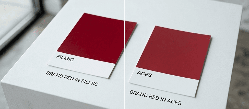
If your work depends on brand color accuracy, Filmic is usually the safer choice.
2) Fast portfolio work
ACES adds complexity:
- you need to install configs properly
- you need consistent texture color spaces
- you need to know what “ACEScg” actually means
If you just want clean renders fast, Filmic is simpler.
3) Texture authoring mismatch
Most texture libraries and assets are authored assuming:
- sRGB base color
- standard PBR workflow
- typical “game engine” viewing conditions
If you switch to ACES without adjusting anything, you might see:
- dull base color
- weird midtones
- less contrast
Recommended settings: what to use instead of “full ACES”
A lot of artists don’t need full ACES.
They just want:
- better highlight rolloff
- more pleasing contrast
- less blown-out whites
Here are practical options that don’t break your pipeline.
Option A: Stick to Filmic, but use a better lighting setup
This is the most underrated fix.
If your renders look harsh, it’s often lighting, not color management.
For product viz:
- use a neutral HDRI
- add a key area light
- use a fill light at low strength
- avoid clipping highlights
Option B: Filmic + gentle contrast control
Instead of ACES, you can:
- keep Filmic
- grade lightly in Blender compositor
- or do a final pass in Photoshop
This keeps your workflow simple and predictable.
Option C: Use AgX (if available in your Blender version)
AgX has become popular because it gives:
- nice highlight handling
- pleasing contrast
- less “gray” look than some ACES configs
For many Blender artists, AgX is a sweet spot:
more modern than Filmic, less heavy than ACES.
Common mistakes (and how to fix them)
- “ACES made my render look washed out”
- Fix: Your lighting is probably too bright, or you’re expecting Filmic-style punch. Reduce exposure and grade intentionally.
- “My textures don’t match Substance Painter anymore”
- Fix: Painter uses its own viewing transform. Don’t expect a perfect match unless you’re managing color across the pipeline.
- “My product color changed and the client complained”
- Fix: Use Filmic for client-accurate work, and grade gently instead of switching transforms.
- “Highlights look weird or gray”
- Fix: Check roughness values and ensure you’re not overexposing the scene.
Mini scenario: what I’d use for product visualization in Blender
If I’m doing product visualization for a client and I need:
- fast turnaround
- consistent results
- accurate colors
I’d use:
- Blender Filmic
- a neutral HDRI
- a simple studio lighting rig
- light grading in the compositor
If I’m doing cinematic look dev or VFX-style work, then ACES starts making sense.
ACES can be a great upgrade for certain Blender pipelines, especially if you’re doing compositing, VFX-style work, or multi-software grading. But it’s not automatically better for product visualization, and it can easily reduce saturation and shift colors in ways that clients don’t love.
If you want the simplest high-quality approach: stick with Filmic, light your scene well, and do a light grade at the end. If you want maximum pipeline consistency and grading headroom, then ACES is worth testing properly in a controlled scene.
About the Author: EFB Media
EFB Media is a 3D artist and content creator specializing in Blender workflows, product visualization, and realistic rendering. With years of experience creating digital art, they share insights and tutorials to help other artists master their craft.